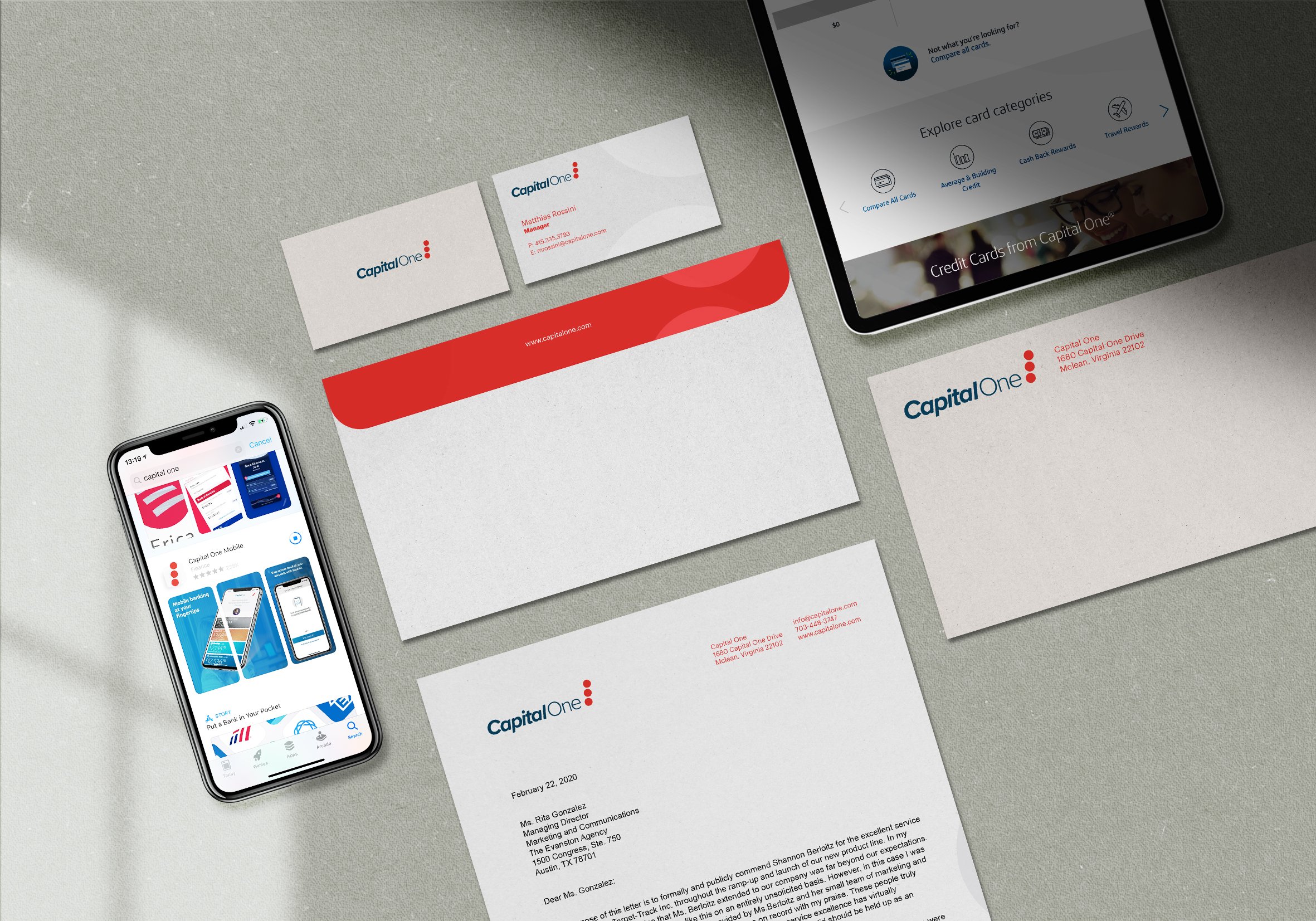
Capital One
{ Branding, Logo Design }
Role: Lead Designer
Year: 2019
Client: Personal Project
The objective is to facelift an existing brand that has not been rebranded within the last decade. Revisit the original brand history but maintain the integrity of the previous brand identity: convenience. Also to help strengthen the brand equity by adding more value and meaning behind their brand logo.
↳ Objective
Capital One is a bank that targets the younger adults who are new to banking. Learning how to manage your money isn’t easy if everything looks boring and mundane. With this project, we had the opportunity to be playful with the design. Using three red circles stacked on top of on another leaning towards the right gives the logo motion, the idea of always moving where you go.
With the concept of have three dots, each dot represents the different services Capital One offers: Home, Auto, and Savings. This allowed the rebrand to have a new refreshed modern look.
↳ Approach


